The Federal Budget for Fiscal Year 2012 came out today. We continue the tradition (because we've done it before, in 2005, 2007, 2008, 2009, and 2010) of producing some simple graphs from the tables provided.
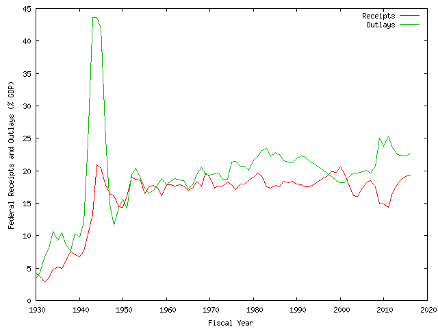
Here's a graph of Federal receipts and outlays since 1977, expressed as percent of GDP; post-2010 numbers are estimates:
![[In and Out]](/ps/images/fed2012/fed_inout.png)
Here's what that works out to in terms of deficit spending:
![[Usually More Out]](/ps/images/fed2012/fed_deficit.png)
Click on the graphs for their fullsize versions. Data is here (snipped from Table 1.2 on this page) and my Gnuplot script is here. If you'd like to see the data extended back to 1930: here's the receipt/outlays graph and here's the deficit graph.
Standard disclaimer: if you're thinking this is simple-minded, you're right. In my defense, the percent-of-GDP seems appropriate for historical comparison; it seems to be (arguably) a good measure of what we can "afford"; and, if you believe deficits "damage the economy", then it's a pretty good proxy for the level of damage.
Those innocent little red and green squiggles do not adequately portray the fiscal difficulty we're in. If it were a feature in Gnuplot, I'd animate the graphs and set them to music, something that would convey impending doom.
Some other reactions:
-
Peter
Suderman at Reason observes the irony of President Obama
righteously griping in his most recent State of the Union address:
We have to confront the fact that our government spends more than it takes in. That is not sustainable.
… followed, a few weeks later, by a budget that fails to confront the fact that our government spends more than it takes in. That's not only unsustainable, it's dishonest and cowardly. -
While you're at the Reason site, read their article
on "The
19 Percent Solution", from the March issue of the magazine.
It's the long version of the plan we
discussed here
back in December. Their goal is to get to a level of federal spending in
line with historical revenue figures--about 19% of GDP--within the next
10 years.
There would be shrieks and howls if the Reason plan were implemented, of course. But, as the authors point out, and you can check for yourself on the graphs above, Federal outlays were roughly at the 19% level between 1997 and 2002. Even in FY2007, expenditures were "only" at 19.6% of GDP. These years were not previously known as implementations of a skeletal libertarian state.
-
Also recommended: click on over to Daniel J. Mitchell's
blog and just start reading anywhere. For all the blather
about "cuts", Mitchell points out the FY2012 increases over
the current year:
Even worse are the longer trends. Since 2001, a period when inflation has been low, Mitchell calculates:o 17 percent more money for International Assistance Programs;
o 24 percent more money for the Executive Office of the President;
o 13 percent for the Department of Transportation; and
o 12 percent more for the Department of State.
And this is all the "discretionary" stuff; Mitchell points out that the entitlement side is projected to be even worse.o 112 percent more spending for the Department of Agriculture;
o 100 percent more spending for the Department of Education;
o 154 percent more spending for the Department of Energy;
o 110 percent more spending for the Department of Health and Human Services;
o 175 percent more spending for the Department of Labor; and
o 82 percent for the Department of Transportation.
(Data table for this article here.)
![[The Blogger and His Dog]](/ps/images/me_with_barney.jpg)


